Creating a cube lighting effects with image and solid Color in 10 minutes
cube
effects
image
solid
CSS
lighting
- By Code solution
- Dec 19th, 2021
- 0 comments
- 12
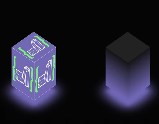
In this post, we are creating cube lighting effects with image and solid color used Websites/Apps to indicate for animation
It's time to have fun with the perspective in CSS.
We are going to convert the cube light effect in a square on and another image with a square shown in the image below :
HTML Code
<!doctype html>
<html>
  <head>
    <meta charset="utf-8">
    <title>Cube light effects</title>
    <link rel="stylesheet" href="style.css">
  </head>
  <body>
    <div class="cube">
      <div class="top"><img src="https://www.codesolution.co.in/images/default/icon.webp" /></div>
      <div><span style="--si:0;"><img src="https://www.codesolution.co.in/images/default/icon.webp" /></span><span style="--si:1;"><img src="https://www.codesolution.co.in/images/default/icon.webp" /></span><span style="--si:2;"><img src="https://www.codesolution.co.in/images/default/icon.webp" /></span><span style="--si:3;"><img src="https://www.codesolution.co.in/images/default/icon.webp" /></span></div>
    </div>
    <div class="cube">
      <div class="top"></div>
      <div><span style="--si:0;"></span><span style="--si:1;"></span><span style="--si:2;"></span><span style="--si:3;"></span></div>
    </div>
  </body>
</html>
CSS Code
* {
  margin: 0;
  padding: 0;
  box-sizing: border-box;
}
body {
  display: flex;
  justify-content: space-around;
  flex-direction: row;
  align-items: center;
  min-height: 100vh;
  background: #050505;
}

.cube {
  position: relative;
  width: 300px;
  height: 300px;
  transform-style: preserve-3d;
  transform: rotateX(-30deg);
  animation: animation 4s linear infinite;
}

@keyframes animation {
  0% {
    transform: rotateX(-30deg) rotateY(0deg);
  }
  100% {
    transform: rotateX(-30deg) rotateY(360deg);
  }
}

.cube div {
  position: absolute;
  top: 0;
  left: 0;
  width: 100%;
  height: 100%;
  transform-style: preserve-3d;
}

.cube div span {
  position: absolute;
  top: 0;
  left: 0;
  width: 100%;
  height: 100%;
  background: linear-gradient(#151515, #7264bb);
  transform: rotateY(calc(90deg * var(--si))) translateZ(150px);
}
.cube div span img {
  position: absolute;
  top: 0;
  left: 0;
  width: 100%;
  height: 100%;
  border: 1px solid #fff;
}
.top {
  position: absolute;
  top: 0;
  left: 0;
  width: 300px;
  height: 300px;
  background: #222;
  transform: rotateX(90deg) translateZ(150px);
}

.top img {
  position: absolute;
  top: 0;
  left: 0;
  width: 100%;
  height: 100%;
  border: 1px solid #fff;
}
.top::before {
  content: "";
  position: absolute;
  top: 0;
  left: 0;
  width: 300px;
  height: 300px;
  background: #7264bb;
  transform: translateZ(-350px);
  filter: blur(20px);
  box-shadow: 0 0 120px rgba(114, 100, 187, 0.2),
    0 0 200px rgba(114, 100, 187, 0.4), 0 0 300px rgba(114, 100, 187, 0.6),
    0 0 400px rgba(114, 100, 187, 0.8), 0 0 500px rgba(114, 100, 187, 1);
}

I hope you find this post to be helpful and thanks for reading it 
Social Links
Technologies
Tags
- #application
- #Express
- #NodeJS
- #Application
- #ionic2
- #nodeJs
- #API
- #module
- #Android
- #NPM
- #notification
- #message
- #push notification
- #NodeJs
- #Loader
- #ionic
- #android
- #native
- #React
- #AngularJs
- #menu
- #map
- #Setup
- #Android
- #card
- #IOS
- #Firebase
- #swipe
- #Login
- #android studio
- #Button
- #Navigation
- #Web
- #database
- #Drawer
- #React Native
- #ReactJS
- #boilerplate
- #React native
- #Redux
- #HTML
- #CSS
- #Studio
- #Slider
- #Validation
- #Form
- #Alert
- #Import
- #Excel
- #express
- #feed
- #ionic3
- #Effect
- #screen
- #Laravel
- #effect
- #Flutter
- #Ios
- #PostgreSQL
- #Database
- #image