Multilevel dropdown menu creating in ReactJS
ReactJS
Multilevel
dropdown
menu
NextJS
- By Sudarshan Vishwakarma
- Mar 30th, 2022
- 0 comments
- 12
Multilevel dropdown menus are a staple of web design. With the ability to provide multiple options to select from, they make navigation bars dynamic and organized.
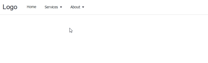
For any developer working in React or any React-based project like Gatsby or Next.js, this tutorial covers the step-by-step process of how to implement the dropdown feature in a React project. At the end of this guide, we will have the menu below:
To follow this tutorial, ensure you have a basic understanding of React and confirm you have Node.js installed on your computer. Then, we can get started.
Setting up the React project
Let’s start by creating a new React project called multilevel-dropdown-menu by running the following command:
npx create-react-app react-multilevel-dropdown-menu
Once the project generates, navigate inside the project folder using cd multilevel-dropdown-menu or simply open the project with a code editor.
Then, run the npm start built-in command to start the project in development mode. The app should launch in the browser at http://localhost:3000.
Creating the project files
Head over to the src folder and delete all the files except the index.js. Next, create a folder called components inside the src and add the following component files: Dropdown.js, MenuItems.js and Navbar.js.
In the App.js file, add the following starting code:
import Navbar from "./components/Navbar";

const App = () => {
    return ( <
        header >
        <
        div className = "nav-area" >
        <
        a href = "/#"
        className = "logo" >
        CodeSolution <
        /a> <
        Navbar / >
        <
        /div> < /
        header >
    );
};

export default App;
Rendering top-level menu items
Let’s start building by rendering the top menu items. To do this, we must get the menu data by creating a menuItems.js file in the src folder and add the following:
export const menuItems = [{
        title: "Home",
    },
    {
        title: "Services",
        submenu: [{
                title: "web design",
            },
            {
                title: "web development",
                submenu: [{
                        title: "Frontend",
                    },
                    {
                        title: "Backend",
                        submenu: [{
                                title: "NodeJS",
                            },
                            {
                                title: "PHP",
                            },
                        ],
                    },
                ],
            },
            {
                title: "SEO",
            },
        ],
    },
    {
        title: "About",
        submenu: [{
                title: "Who we are",
            },
            {
                title: "Our values",
            },
        ],
    },
];
Moving on, notice we imported the Navbar component. So, head over to the components/Navbar.js and add the following code:
import {
    menuItems
} from "../menuItems";
import MenuItems from "./MenuItems";
const Navbar = () => {
    return ( <
        nav >
        <
        ul className = "menus" > {
            menuItems.map((menu, index) => {
                const depthLevel = 0;
                return <MenuItems items = {
                    menu
                }
                key = {
                    index
                }
                depthLevel = {
                    depthLevel
                }
                />;
            })
        } <
        /ul> <
        /nav>
    );
};

export default Navbar;
Open the components/MenuItems.js file and add the following code:
import {
    useState,
    useEffect,
    useRef
} from "react";

import Dropdown from "./Dropdown";

const MenuItems = ({
    items,
    depthLevel
}) => {
    const [dropdown, setDropdown] = useState(false);

    let ref = useRef();

    useEffect(() => {
        const handler = (event) => {
            if (dropdown && ref.current && !ref.current.contains(event.target)) {
                setDropdown(false);
            }
        };
        document.addEventListener("mousedown", handler);
        document.addEventListener("touchstart", handler);
        return () => {
            // Cleanup the event listener
            document.removeEventListener("mousedown", handler);
            document.removeEventListener("touchstart", handler);
        };
    }, [dropdown]);

    const onMouseEnter = () => {
        window.innerWidth > 960 && setDropdown(true);
    };

    const onMouseLeave = () => {
        window.innerWidth > 960 && setDropdown(false);
    };

    return ( <
        li className = "menu-items"
        ref = {
            ref
        }
        onMouseEnter = {
            onMouseEnter
        }
        onMouseLeave = {
            onMouseLeave
        } >
        {
            items.submenu ? ( <
                >
                <
                button type = "button"
                aria - haspopup = "menu"
                aria - expanded = {
                    dropdown ? "true" : "false"
                }
                onClick = {
                    () => setDropdown((prev) => !prev)
                } >
                {
                    items.title
                } {
                    " "
                } {
                    depthLevel > 0 ? < span > & raquo; < /span> : <span className="arrow" / >
                } <
                /button> <
                Dropdown depthLevel = {
                    depthLevel
                }
                submenus = {
                    items.submenu
                }
                dropdown = {
                    dropdown
                }
                /> <
                />
            ) : ( <
                a href = "/#" > {
                    items.title
                } < /a>
            )
        } <
        /li>
    );
};

export default MenuItems;
Let’s now open the components/Dropdown.js file and access the prop so we can render the submenu like so:
import MenuItems from "./MenuItems";
const Dropdown = ({
    submenus,
    dropdown,
    depthLevel
}) => {
    depthLevel = depthLevel + 1;
    const dropdownClass = depthLevel > 1 ? "dropdown-submenu" : "";
    return ( <
        ul className = {
            `dropdown ${dropdownClass} ${dropdown ? "show" : ""}`
        } > {
            submenus.map((submenu, index) => ( <
                MenuItems items = {
                    submenu
                }
                key = {
                    index
                }
                depthLevel = {
                    depthLevel
                }
                />
            ))
        } <
        /ul>
    );
};

export default Dropdown;
Open the src/app.css file and temporarily comment-out the display: none; part of the CSS:
*{
    margin: 0;
    padding: 0;
    box - sizing: border - box;
}

body {
    font - family: sans - serif;
}

header {
    height: 58 px;
    box - shadow: 0 1 px 3 px 0 rgba(0, 0, 0, 0.07),
    0 1 px 2 px 0 rgba(0, 0, 0, 0.05);
    color: #212529;
}

.nav-area {
  display: flex;
  align-items: center;
  max-width: 100%;
  margin: 0 auto;
  padding: 0 20px;
  height: 58px;
}

.logo {
  text-decoration: none;
  font-size: 25px;
  color: inherit;
  margin-right: 20px;
}

.menus {
  display: flex;
  list-style: none;
}

.menu-items {
  position: relative;
  font-size: 14px;
}

.menu-items a {
  display: block;
  font-size: inherit;
  color: inherit;
  text-decoration: none;
}

.menu-items button {
  color: inherit;
  font-size: inherit;
  border: none;
  background-color: transparent;
  cursor: pointer;
  width: 100%;
}

.menu-items a,
.menu-items button {
  text-align: left;
  padding: 0.7rem 1rem;
}

.menu-items a:hover,
.menu-items button:hover {
  background-color: # f2f2f2;
}

.arrow::after {
        content: "";
        display: inline - block;
        margin - left: 0.28 em;
        vertical - align: 0.09 em;
        border - top: 0.42 em solid;
        border - right: 0.32 em solid transparent;
        border - left: 0.32 em solid transparent;
    }

    .dropdown {
        position: absolute;
        right: 0;
        left: auto;
        box - shadow: 0 10 px 15 px - 3 px rgba(46, 41, 51, 0.08),
        0 4 px 6 px - 2 px rgba(71, 63, 79, 0.16);
        font - size: 0.875 rem;
        z - index: 9999;
        min - width: 10 rem;
        padding: 0.5 rem 0;
        list - style: none;
        background - color: #fff;
        border - radius: 0.5 rem;
        display: none;
    }

    .dropdown.show {
        display: block;
    }

    .dropdown.dropdown - submenu {
        position: absolute;
        left: 100 % ;
        top: -7 px;
    }
Save the file and test your project.Thanks
About the author

- #application
- #Express
- #NodeJS
- #Application
- #ionic2
- #nodeJs
- #API
- #module
- #Android
- #NPM
- #notification
- #message
- #push notification
- #NodeJs
- #Loader
- #ionic
- #android
- #native
- #React
- #AngularJs
- #menu
- #map
- #Setup
- #Android
- #card
- #IOS
- #Firebase
- #swipe
- #Login
- #android studio
- #Button
- #Navigation
- #Web
- #database
- #Drawer
- #React Native
- #ReactJS
- #boilerplate
- #React native
- #Redux
- #HTML
- #CSS
- #Studio
- #Slider
- #Validation
- #Form
- #Alert
- #Import
- #Excel
- #express
- #feed
- #ionic3
- #Effect
- #screen
- #Laravel
- #effect
- #Flutter
- #Ios
- #PostgreSQL
- #Database
- #image